Website Image Guidelines
This page displays suggested image size guidelines for each component that utilizes images to help with future image selection. Please refer to the recommended size options below. If you have any questions, please reach out to your Project Manager.
Cards Component

Card 1 Content
Card 2 Content
Card 3 Content
Card 4 Content
Sizes for these components will vary depending on the number of cards present in a row - there are options for 1, 2, 3 or 4 cards.
1 card: 16:9
2 cards: 4:3
3 cards: 3:2
4 cards: 1:1
Best practice dictates that all images used in a single cards component should be approximately the same size.
Content Row

Sample Text - this is what the component will look like
Minimum recommended height: 400px
Ratio will depend on site design (PM, update accordingly)
Hero Carousel Component
Desktop: 1300px x 600px (or 13:6 ratio)
Tablet/Mobile: 300px x 200px (or 3:2 ratio)
Image Carousel
Image size will vary depending on the exact usage and number appearing at a time, but best practice dictates having all items in a carousel be the same size.
Icons


Recommended dimensions: maximum of 200x200px (ratio of 1:1)
Article Page Listing
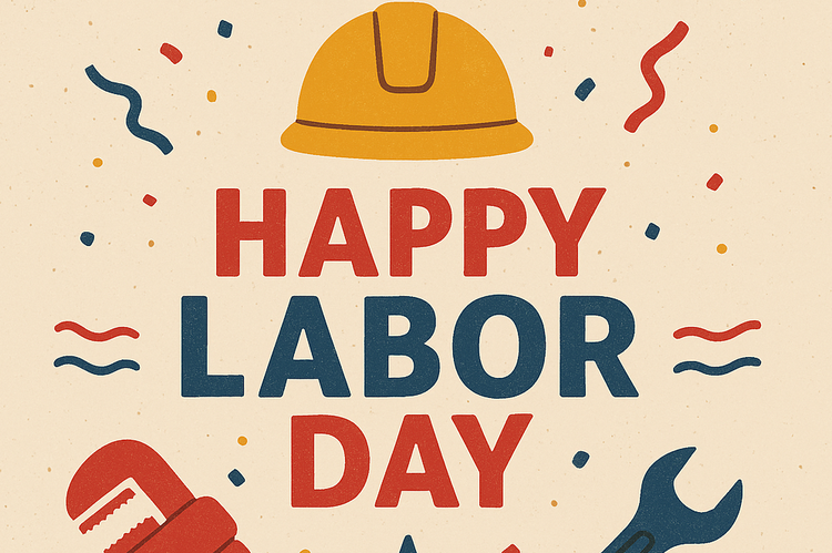
8/31/2025

7/3/2025
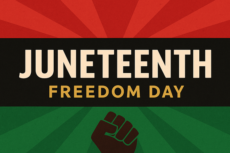
6/18/2025
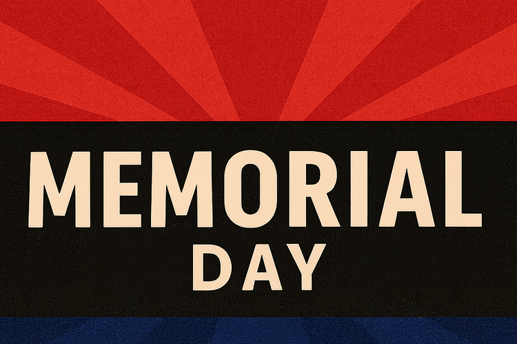
5/25/2025
While the actual size of the banner on each page may vary, for the Feature Image that appears on article previews, the recommended image ratio is 1:1.